25 Best-Converting Facebook Ad Types + Examples in 2025
The best converting Facebook ads in 2025 start with a clear goal. Whether you want more sign-ups, product sales, or app downloads, your ad should speak to the right audience with a message that fits. When your creative, format, and goal are aligned, better results follow.
In this article, we’ll cover:
- What makes Facebook ads convert
- 25 types of high-converting Facebook ads
- Tips for creating ads that convert
Let’s start by talking about what makes an ad high-converting.
What makes a Facebook ad “high-converting” in 2025?
Many might think a high-converting ad is just one that gets a lot of clicks, but getting clicks doesn’t guarantee results on its own. A click doesn’t mean much if it doesn’t lead to something valuable for your business. In 2025, a “conversion” can mean different things depending on your goal:
- Lead generation: Someone fills out a form or subscribes to your mailing list
- Sales: A user purchases a product or service subscription
- App installs: A user downloads and installs your app on their device
- Sign-ups: A user joins a service or platform
What really matters is that the ad moves someone one step closer to your intended result. That means the creative, copy, and audience targeting all need to work together.
Key elements of high-converting Facebook ads
If you’re trying to improve conversions, your creative is where it starts. No targeting tweak or budget shift can fix an ad that’s confusing, forgettable, or too passive. Compelling Facebook ads usually hit on three key pillars:
- Clarity: People scroll fast. Your ad should communicate what it’s offering and what to do next within the first second or two. That means no clever headlines that need decoding, no vague offers, and no missing calls to action (CTAs). Use plain language and make the benefit obvious.
- Emotion: The best ads make people feel something. That could be urgency, curiosity, belonging, or even relief. Whether you’re showing a frustrated customer finally finding a solution or tapping into seasonal moments like Mother’s Day, emotion helps people connect and remember.
- Direct response: A high-converting ad drives action. That means pairing a strong hook with a clear offer and a reason to act now. A good direct response ad shows what’s at stake, what the user gets, and what they need to do. The CTA is the point, and not just an afterthought.
Using these three elements helps you to make a good Facebook ad. If you already have ads but aren’t sure if they’re good enough, running a Facebook ads audit might be helpful.
25 Best-converting Facebook ad types that work
There’s no single formula for a high-converting ad, but the best ones tend to follow a few patterns. The format, message, and creative style all depend on what you’re trying to get people to do. Let’s take a look at some examples of great Facebook ads and ad types that work:
1. UGC video
This type of ad could be a video of a customer using a product while they talk about their experience with it. The caption can share a quick backstory and be linked to a bundle offer.
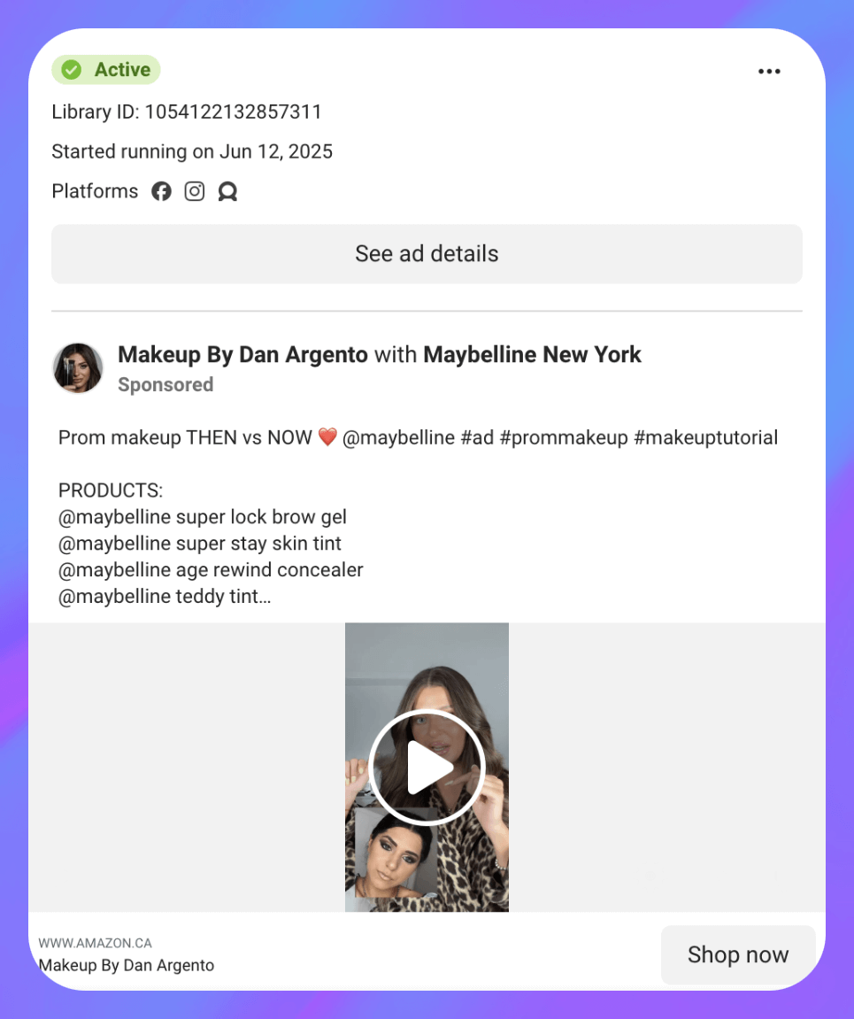
UGC videos resemble from a post from a friend, not a polished ad. Content like this can often stop the scroll because the video is relatable, and the testimonial style adds social proof. UGC-style ads work well for product discovery, especially in e-commerce.
2. Lead gen video ad

Lead generation ads work well for enticing users into high-intent signups. This ad type might be a 15-second vertical video where a creator walks through a downloadable resource, like a “5-step sales template,” while on-screen text calls out the benefit and a CTA prompts the viewer to sign up.
It’s quick, specific, and focused on the outcome. The creator might hold up the actual lead magnet (like a PDF or checklist), making the offer feel real and valuable. These types of ads work because they preview what users get instead of just asking for info upfront.
3. Carousel ads
This ad format uses multiple image cards to highlight different features of a product or service, typically five slides, each with a visual and a short, benefit-focused line of copy. The final slide includes a CTA like “Download now.”

It’s commonly used to drive app installs, but it works well anytime you want to walk someone through a product step by step. Carousels act like a guided tour, showing multiple selling points in a scrollable, easy-to-digest format.
4. UGC image ad

This ad can feature a selfie-style photo of a customer holding a skincare product with a caption that reads, “This cleared my skin in 3 weeks.” The image can look like something pulled straight from Instagram — unpolished, natural, and personal. The ad can link directly to the bundle offer.
This format is a strong performer for ecommerce product discovery. The low production quality is actually a strength here because it feels like a real recommendation from a peer, which builds instant credibility and interest.
5. Static image ad
This ad format uses a single, eye-catching image paired with bold text overlay to highlight the product’s main benefit. It might showcase a close-up of the product in use or a clean shot of the item itself, with a headline like “Longer lashes in seconds” or “Now only $8.” The caption often reinforces the benefit and adds a short, friendly nudge to take action.

This format works well for product launches or budget-friendly offers. The image grabs attention right away, and the high-contrast text spells out the benefit before the viewer even reads the caption.
6. Demo-style ad
This ad format focuses on showing how the product works in a real-life scenario. It could be a screen recording of a tool in action, a person using a product step by step, or even a visual transformation like before-and-after shots. The goal is to demonstrate value clearly and quickly.

This approach works well for products that require a little explanation, such as apps, gadgets, tools, or anything with features that might not be obvious at first glance. When done right, these videos answer questions before someone even clicks.
7. Meme-style image ad
This ad format uses humor or relatability to grab attention. The image usually mimics the look and feel of a social media meme, like screenshot-style text, familiar pop culture references, or a funny moment that ties back to the product. The caption then pivots into the actual offer or CTA.

Meme-style ads work well for brands that want to connect through humor and cultural references. By using familiar formats and a casual tone, these ads can grab attention in a way that feels natural, not like a traditional promotion.
8. Testimonial quote ad
This ad uses a static image or simple background with a customer quote front and center. Think black text on a light backdrop with a five-star graphic or a verified buyer's name underneath. The caption expands on the quote and points to a specific offer or product page.

These are great for building trust, especially for higher-ticket items or services that need more credibility. Social proof doesn’t have to be flashy to work.
9. Countdown or limited-time offer ad
This ad highlights a time-sensitive deal with bold text and visual urgency. It might include a countdown (“Only 3 hours left!”), a limited quantity (“100 boxes remaining”), or a seasonal deadline (“Ends Sunday night”). Creatives often include a clock icon, red highlight, urgent copy, or other visual signal to create pressure.

This ad style works well across industries when the goal is to prompt quick action. Pairing urgency with a compelling offer is still one of the most reliable ways to get people to move.
10. Product benefits slideshow ad
This ad uses multiple still frames stitched together into a lightweight video or slideshow. Each slide features a product benefit, often with large bold text and simple visuals like “No wires,” “Fast setup,” or “24-hour battery.”
This format is great when your product has multiple selling points, but you want to keep things fast and low-budget. It’s more dynamic than a static image but easier to produce than a full video.
11. Retargeting offer ad
This ad targets users who’ve visited a product page but didn’t buy. It typically features the product they viewed, a friendly nudge (“Forget something?”), and a time-limited discount or incentive. The goal is to close the deal with minimal friction.
Retargeting ads like these work well because they speak to warm audiences who have already shown interest. The key is to stay casual and helpful, not pushy.
12. Lead form ad with instant incentive

This ad uses Facebook’s built-in lead form and pairs it with an immediate offer, like a free sample, checklist, or discount code. It’s usually formatted as a static image or short video that highlights the offer and uses a native “Sign Up” button.
It’s perfect for campaigns where the goal is to grow your email list, offer trials, or build up leads for a sales team. The key is making the value of signing up obvious and frictionless.
13. Comparison chart ad
This ad features a simple side-by-side chart showing how a product or service stacks up against competitors. It’s often a static image with rows like “Price,” “Shipping,” “Features,” and a highlight showing where your offer wins.

This style works best for crowded markets where users are weighing multiple options. If your offer beats others on key factors, this is a clean way to spell it out.
14. Explainer animation ad
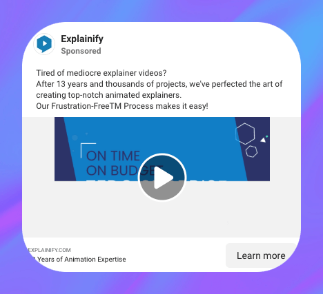
This ad type uses motion graphics or animated illustrations to walk users through how something works, whether it’s a service, a tech product, or a subscription box. The visuals are often minimal and clean, with text overlays and a simple voiceover or music.
It’s a solid choice for products that solve a problem people might not fully understand yet. Rather than relying on lifestyle visuals, explainer animations focus on clarity and structure.
15. “Problem-solution” ad
This ad starts by calling out a relatable pain point, then pivots into the product as the solution. The format varies. It could be a short video, a UGC testimonial, or a static image with a clear headline like “Tired of X?” followed by the answer.

It works well across most verticals and funnel stages because it taps into the viewer’s mindset before pitching the product. When the problem feels real, the solution feels more relevant.
16. “As seen in” credibility ad

This ad uses logos from media outlets, awards, or major platforms to build instant trust. It might be a static image with the product in the center and a row of recognizable logos underneath, think “As seen in Forbes, Vogue, TechCrunch.” The caption usually reinforces credibility or links to a press article or influencer mention.
This format works well for products or services that have social proof but aren’t yet widely known. It gives users a reason to take your offer seriously.
17. Limited edition product ad

This ad promotes a product drop that won’t last, either seasonal, exclusive, or capped at a certain number of units. It usually uses bold visuals with language like “Limited run,” “Only 500 made,” or “Available this week only.” The caption leans into exclusivity and often includes a deadline.
It’s a great way to drive urgency and FOMO, especially if your brand already has fans who like to grab new releases before they’re gone.
18. Scroll-stopper visual ad
This ad relies on a striking visual. Something weird, bold, colorful, or unexpected to make people pause, like a person in a giant banana suit holding a laptop, or a mascara wand twice the size of the actual product. The image does the heavy lifting, and the copy is often minimal, just reinforcing the core message.
These ads work at the top of the funnel to stop the scroll and spark curiosity. Once they’ve paused, you can retarget with more details later.
19. Giveaway or contest ad

This ad promotes a limited-time giveaway or contest, usually with a headline like “Win a $250 gift card!” or “Enter to win our summer bundle.” The image typically features the prize clearly, and the caption outlines how to enter, often something like “Follow, like, and tag a friend.”
These work well for growing engagement, increasing followers, or building a list fast. The key is making the prize relevant to your audience and keeping the entry steps simple.
20. First-person testimonial video ad
This ad features a customer talking directly to the camera, describing their problem and how the product helped them. It often includes quick cuts showing the product in use, but the core of the ad is the person’s face and story. The caption usually includes a quote and a link to learn more.

It works because it feels personal and unscripted, even if it’s planned out behind the scenes. Great for products where trust and relatability are key.
21. Value stack ad

This ad lists everything the customer gets in one offer, often shown visually in a stack or bundle. For example, “What’s included: 5 workouts, 3 meal plans, private coaching, and bonus recipes.” The image shows the full package, and the CTA drives to a sales page or sign-up form.
This format works well when you want to show just how much you’re giving for the price. It’s often used in info products, coaching programs, and SaaS deals.
22. Step-by-step how-to ad

This ad shows a simple process in action, like “How to style this dress 3 ways” or “How to brew the perfect cup.” It can be a short video, a carousel, or even a slideshow with each frame covering one step. The tone is educational but still product-forward.
It’s a strong play for middle-of-funnel audiences who need a little more info before converting. Teaching while showcasing your offer builds trust and positions your product as part of the solution.
23. Quote overlay ad
This ad uses a simple image with a short, bold quote overlaid. The image is often a photo of a person or a product, and the quote can be from a customer, a founder, or even pulled from a review. The caption reinforces the message or tells a little story behind the quote.

This format works well for brand-building, especially when you want to lead with emotion or personal impact rather than a feature set.
24. “Back in stock” ad

This ad announces the return of a sold-out product, usually with a message like “It’s finally back” or “You asked — we listened.” It works best when paired with social proof (“Over 5,000 people joined the waitlist”) or a note of urgency (“Limited quantities available”).
It’s a great conversion play for fans who missed the first drop or for cold audiences when paired with a strong hook.
25. Creator walkthrough ad

This ad features a creator showing how they use your product in their everyday routine. No hard sell, just a natural plug. It might look like “A day in the life” or “Here’s how I plan my week,” with the product woven in naturally.
This format performs well across verticals like wellness, beauty, and lifestyle. It blends influencer trust with real use-case education.
What these ads can teach you about conversion
Looking through dozens of high-converting Facebook ads, a few key patterns stand out. No matter the industry or audience, the ads that perform consistently well tend to follow the same core principles.
Here are some recurring traits across top-performing ads:
- Clear, outcome-driven messaging: The most effective ads don’t just describe the product, they show what it helps people do. “Track your spending in seconds” beats “All-in-one finance tool.”
- Strong creative hooks: Whether it’s a bold visual, a punchy headline, or a surprising format, good ads get attention fast. Scroll-stopping doesn’t mean flashy, it just means relevant and clear.
- Alignment between creative and goal: Top ads don’t try to do too much at once. A lead-gen ad focuses on the offer. A retargeting ad focuses on sealing the deal.
- Mobile-first formatting: Vertical video, short copy, and large text all help optimize for how people actually browse Facebook.
- Consistency across the funnel: When the ad, caption, and landing page all match in tone and message, conversion rates go up.
There are also pitfalls to avoid. These include:
- Weak or missing CTAs: If you’re not clearly asking for action, you might end up losing it.
- Slow-loading landing pages: Doesn’t matter how good the ad is if the page doesn’t load or match the promise.
- Too much copy or clutter: It’s best to simplify your message to avoid overwhelming viewers.
- Overly broad targeting: A great ad shown to the wrong audience won’t convert.
- No testing or iteration: Even good ads wear out. Sticking with a single creative too long can tank results.
Tips: How to create Facebook Ads that convert
Writing an ad that actually drives results doesn’t have to be complicated, but it does need to be intentional. The best converting Facebook ads all start with a strong offer, clear visuals, and a good understanding of who they’re talking to. Here are a few tips to help you create your ads:
- Lead with the offer: Make sure your deal or value prop is clear from the start.
- Use scroll-stopping visuals: Use faces, motion, bold colors, and whatever grabs attention.
- Match the CTA to the funnel: “Learn more” for awareness, “Buy now” for warm leads, and so on.
- Target smart: Great ads won’t work on the wrong audience, so test and refine.
- Test one thing at a time: Tweak hooks, images, or copy to see what actually works.
Frequently asked questions
How do I know if my Facebook ad is working?
You’ll want to track more than just clicks. Look at your cost per result, return on ad spend (ROAS), and conversion rate. If you’re running multiple creatives, compare them against each other using real data. Reviewing performance across several Facebook ads examples can also help you understand what strong results actually look like.
What’s the average conversion rate for Facebook ads?
It varies by industry, but most fall between 4% and 10%. What matters more is how your ads compare to past performance and whether they’re improving over time. It helps to reference current benchmarks from high-performing Facebook ad examples when setting your goals.
Should I use UGC in Facebook ads?
Yes. User-generated content (UGC) tends to outperform polished brand creative, especially for ecommerce and lifestyle products. UGC builds trust, feels more personal, and often gets better engagement. Just make sure the visuals still follow best practices for layout and sizing.
How many creatives should I test per campaign?
Start with 3 to 5 variations. That’s usually enough to spot a clear winner without overwhelming the algorithm. As performance starts to dip, swap in new creatives to keep things fresh. Automation can help you manage testing and budget adjustments as you scale.
How do I avoid ad fatigue?
Watch for early warning signs like rising cost per result or a drop in CTR. You don’t need to overhaul everything; sometimes a new hook, image, or headline is enough. Some Facebook Ads tools, like Bestever, can help you spot fatigue before it hits your performance too hard.
How Bestever helps you improve your FB ads
If you're looking to run the best converting Facebook ads, it takes more than a good-looking creative. You need data to guide your decisions, tools to speed up testing, and clear signals on what to fix when results drop. That’s where Bestever comes in.
From creative scoring to audience analysis, here’s how Bestever gives you the tools to build ads that actually perform:
- Quickly analyze ad performance instantly: Bestever’s Ad Analysis tool provides real-time feedback on your ads' engagement, conversion potential, budget efficiency, and creative impact. Instead of guessing why an ad isn’t working, you’ll get a clear breakdown of what’s holding it back — whether it’s weak visuals, poor targeting, or budget misalignment.
- Optimize your ads before you burn budget: Instead of waiting 7+ days and spending thousands to see if an ad works, Bestever pinpoints weaknesses before you waste ad spend. Our AI highlights underperforming elements and suggests improvements, so you can pivot your strategy early and avoid a never-ending learning phase.
- Review your old ads and get ideas: Bestever can look at historical data in your ad manager accounts and make suggestions based on past performance results. You’ll be able to see the patterns in high-performing ads, whether it’s a carousel format that drove 30% more engagement or a headline variation that boosted CTR by 20%. Use these insights to refine your next campaign and double down on what converts.
- Know who to target: Not sure if your audience is too broad or too niche? Bestever’s audience analysis tools go beyond basic demographics to uncover key insights. Just enter your website URL and Bestever will analyze your existing traffic to suggest how to refine your ad targeting for higher conversion rates.
- Generate high-converting ad creatives: Need fresh creatives without hiring a big team? Bestever can look at your site and generate creatives in large volumes. Pull stock images and video clips that fit your brand voice, so you can launch more ad variations quickly.
Want to create Facebook ads that convert? Let our team show you how Bestever helps you test faster, improve creatives, and drive stronger results.


Bestever analyzes your ads, tells you what’s working and generates endless variations of your top-performing creatives.


.png)
%20(1).png)
.png)


